Principal Components Analysis (PCA)
The analysis of Raman spectral data often makes use of multivariate techniques, with Principal Component Analysis (PCA) being one of the most widely used. PCA is an unsupervised dimensionality reduction method that can also be used to identify patterns in the data. It transforms the original variables into a new set of uncorrelated axes, known as Principal Components (PCs), which are ordered to capture the greatest variance in the dataset. Each PC is a weighted combination of the original variables, where the weights (called loadings) reflect the contribution of each variable. The transformed coordinates, or scores, represent the original data projected onto these new axes.
Basic usage
With PyFasma, PCA is performed using the pyfasma.modeling.PCA class.
Let’s assume that the data to be analyzed by PCA are stored in a DataFrame df, where the index corresponds to Raman shifts (features) and each column contains the intensity values of a single spectrum (sample). In this format, the DataFrame’s shape is (n_features, n_samples). For consistency with the underlying sklearn.decomposition.PCA class, which assumes DataFrames of shape (n_samples, n_features), the DataFrame has to be transposed to be used in the pyfasma.modeling.PCA class.
For the example data in examples/all_samples.csv, PCA is performed using the following code:
import pyfasma.modeling as mdl

hue = [
    'Healthy' if 'Rbhf' in col
    else 'Osteoporotic'
    for col in df.columns
]

pca = mdl.PCA(df.T, hue=hue)
Here, hue assigns a class label to each sample based on its column name in the df DataFrame. Each class is then plotted in a different color. In this example, spectra from healthy rabbits are identified by the substring "Rbhf" and are labeled as "Healthy", while spectra without it (e.g., containing "Rbof") are labeled "Osteoporotic".
Tip
Although the hue list could be manually defined, using a list comprehension with conditionals makes class assignment both flexible and easy to adapt to different naming conventions.
Warning
The data in examples/all_samples.csv represent only a subset of those used in the PyFasma paper. As a result, the PCA results here will differ slightly from those in the published paper.
The code above creates a pca object that provides several attributes along with a PCA summary plot:
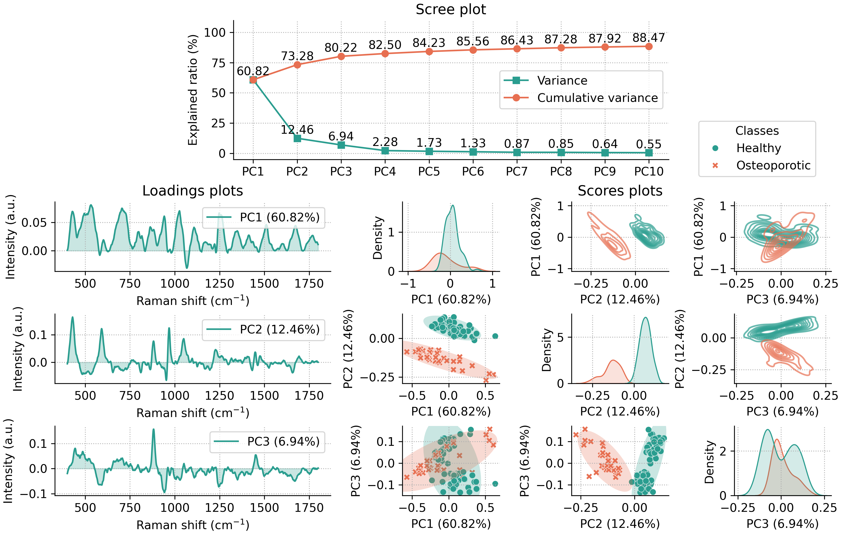
This summary plot includes:
A scree plot for the first 10 principal components (PCs) (the number can be adjusted by using the
n_componentsparameter upon class initialization).Loadings plots for the first three PCs.
Scores plots for the first three PCs, shown in three ways:
Scatter plots of PC pairs with 95% confidence ellipses for each class (lower off-diagonal).
2D density plots of PC pairs (upper off-diagonal).
1D density plots for each PC (diagonal).
By default, the summary plot is shown when the pca object is created. To disable it, pass summary=False during initialization.
Class parameters
The pyfasma.modeling.PCA class accepts both PyFasma-specific parameters and all parameters of
sklearn.decomposition.PCA.
PyFasma parameters
n_components ({int, float, ‘mle’, None}, optional) - Number of principal components to compute and display in the summary plot.
hue (list or None, optional) - Class labels for coloring samples in scores plots.
summary (bool, default=True) - Whether to display the summary plot automatically when the object is created.
Additional parameters
Any extra keyword arguments are passed directly to sklearn.decomposition.PCA (e.g., svd_solver, random_state, whiten).
Note
For more details refer to the pyfasma.modeling.PCA documentation.
PCA plots
The PCA summary plot and all of its individual components can be accessed directly from the pca object. Each plot is created with Matplotlib and Seaborn, accepts commonly used keyword arguments for customization, and returns fig and ax objects so you can further adjust or save the figure. In addition to the plots included in the summary, several additional plots are also available for more detailed exploration.
Scree plots
The scree plot summarizes how much variance is explained by each principal component. It is useful for deciding how many components to retain by identifying the point where additional components have small contribution to the total variance (the “elbow”).
The following code produces the default scree plot, showing both the explained variance ratio and the cumulative explained variance ratio:
fig, ax = pca.scree_plot()
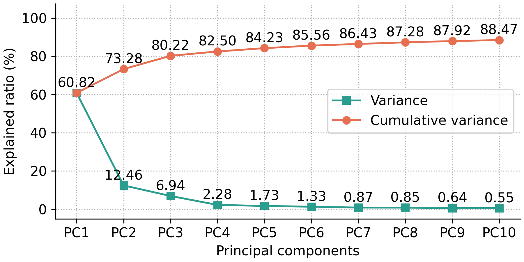
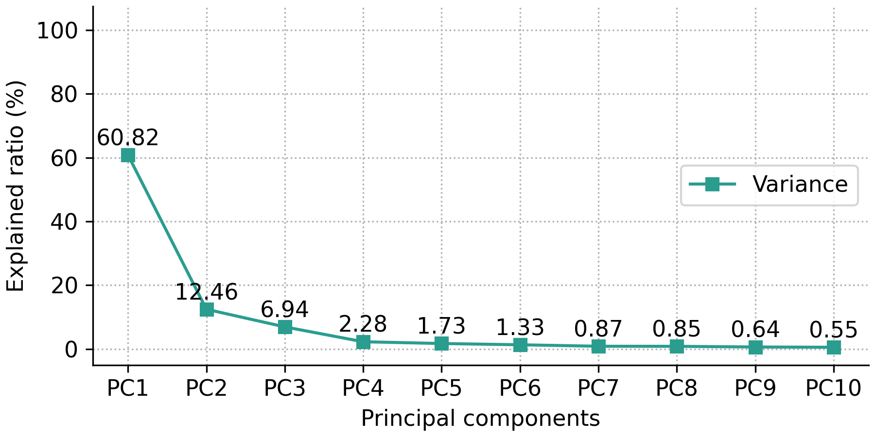
The user has the option to show either the explained variance ratio or the cumulative explained variance ratio using the show_line option, which can either be 'all' (default) for showing both the explained variance ratio and the cumulative explained variance ratio, 'exp_var_rat' for showing only the explained variance ratio, or 'cum_exp_var_rat' for showing only the cumulative explained variance ratio. The following code produces a scree plot containing only the explained variance ratio.
fig, ax = pca.scree_plot(show_line='exp_var_rat')
Note
For more details and customization options refer to the pyfasma.modeling.PCA.scree_plot() documentation.
Scores plots
Scores plots display the projection of each sample onto the principal components. They show how samples relate to each other in the reduced-dimensional space and can reveal clustering, trends, or outliers. They can be displayed as scatter plots, 2D density plots, or 1D density plots along each axis.
Scatter plots
The most basic scores scatter plot can be created using the pca object and the following code:
fig, ax = pca.scores_plot()
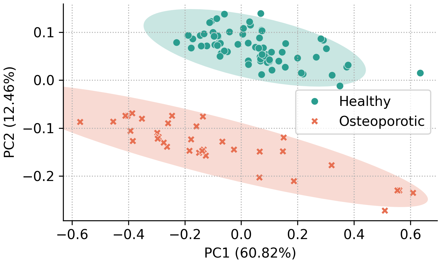
Since no arguments are given, PC2 is plotted against PC1 with default colors and symbols. Additionally, the 95% confidence ellipses are plotted for each class.
In addition to the standard customization options, the pyfasma.modeling.PCA.scores_plot() method provides several plot-specific parameters. The principal components shown on the x- and y-axes can be selected with xpc and ypc. The percentage of explained variance can be toggled with show_percent. Confidence ellipses can be shown or hidden using ellipse and further customized with parameters of the form ellipse_*. Likewise, sample annotations can be enabled with annotate and customized with annotate_* options.
For example, the code below creates a scores plot of PC3 against PC2, with explained variance percentages hidden, ellipses disabled, and point labels enabled:
fig, ax = pca.scores_plot(
    xpc=2,
    ypc=3,
    show_percent=False,
    ellipse=False,
    annotate=True
)
The result is the following plot:
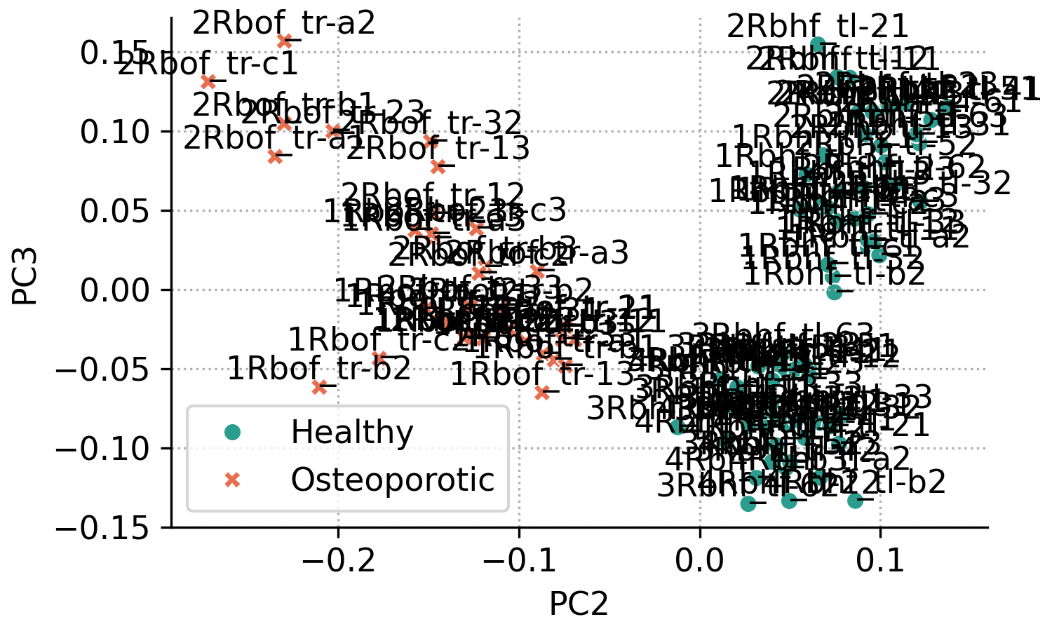
From the previous plot it’s obvious that with many overlapping points, annotated scores plots can quickly become cluttered. Nevertheless, annotations are useful when you need to identify which samples correspond to specific points. The appearance can be improved by adjusting the annotation settings.
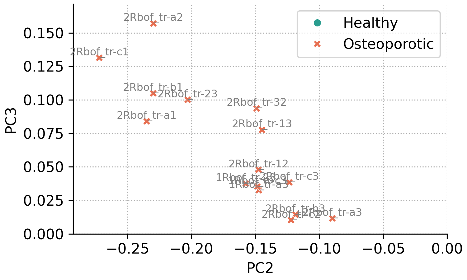
For example, the code below reproduces the same plot as above, but restricted to the region PC2 < 0 and PC3 > 0 (this region is not of particular interest and is used only for demonstration). Annotations are drawn with a smaller font size and lighter color to reduce visual clutter.
fig, ax = pca.scores_plot(
    xpc=2,
    ypc=3,
    show_percent=False,
    ellipse=False,
    annotate=True,
    annotate_fontsize=8,
    annotate_kwargs=dict(color='gray'),
    xlim=[None, 0],
    ylim=[0, None]
)
The result is the following plot:
Note
For more details and customization options refer to the pyfasma.modeling.PCA.scores_plot() documentation.
2D density plots
1D density plots
Loadings plots
Loadings plots show how strongly each feature (Raman shift) contributes to a principal component. Large positive or negative loadings indicate spectral regions that have the greatest influence on that component, which can help interpret the sources of variation in the data and, in some cases, explain differences between sample groups.